USING PHOTOSHOP V8 or V9
Written by Tad Boniecki on 12 March 2006, last
modified 14 January 2017
These notes incorporate material from Scott
Kelby's "The Photoshop Book for Digital
Photographers"
Introduction
Photoshop is widely regarded as the state of the art image editing program. So whatever you want to do to an image you should be able to do it using this program. The downside is that Photoshop can do much more than any one individual is ever going to use. Hence the key to gaining a working knowledge of the program is to identify the sort of things you want to do and how to do them.
Preliminary
settings to facilitate colour corrections
These settings are helpful for auto color and a few other things, but are not mandatory.
1)
Click on the eye-dropper tool and select 3 x 3 average for the options.
2)
Open an image. Cntl-m then double-click on the left eye-dropper. Enter 20 for
R, G, B and hit OK. Double-click on the right eye-dropper. Enter 240 for R, G,
B and hit OK. Double-click on the centre eye-dropper. Enter 128 for R, G, B and
hit OK. Click OK and save as defaults.
3)
Hit cntl-l and then Options. Set "Find light and dark colors" and
"Snap neutral midtones". Single click on each of the 3 rectangles and
check that the same RGB values are present for highlights, shadows and midtones
as in 3) above. Click "Save as defaults" and OK.
4)
View -> Snap off so that you can adjust the cropping window precisely.
General
1)
To undo an action (very useful)
Alt-cntl-z
to undo the last change - can hit this repeatedly.
Hit cntl-z to flip between undo and redo. Never worry about mucking up the image.
Undo will save the day.
2)
To create a macro
Window->Actions->New Action (2nd last button at bottom right) then name it, select a key (eg F11) and hit Record. Do the keystrokes you want to put into the macro. Then hit the stop button at extreme left.
If
you spend many hours on photo corrections then it is almost mandatory to set up
some actions to do routine things, like resizing, sharpening and colour-cast
correction.
3)
To decrease the effect of the last change (extremely useful)
Edit
-> Fade. I think this is the best feature of PhotoShop. Use it!
4)
To repeat the last filter
Cntl-f
but only if you used the filter during this session.
5)
To save a file as
Cntl-shift-s, modify the name and hit CR twice. Sadly, the "save as" dialog is unable to accept a default setting for jpg quality. Or hit alt-i twice. To get around this annoyance simply hit CR twice when saving to a new file name. Just make sure it really is a new name, else you will lose the old one. In this case the jpg quality question will appear after the second hit of CR. You should never save your corrected version over the top of your original ie change the file name instead.
I used to be quite happy with the quality setting
for jpg of 8, but in some cases this introduces quite a lot of noise, eg in
clouds and sky. I have now standardised on quality = 10. My hard drive will
just have to take it on the chin.
To
crop
Hit
'c' and draw the crop area. Move the mouse outside the cropped area to rotate the
image. Hit CR.
To
resize for screen display
Image-> Image size and specify pixels to be your screen resolution and choose resample Bicubic sharper.
To
enlarge a photo using a macro
Window->Actions->New
Action (2nd last button at bottom right) then name it, select a key (F11) and
hit Record. Hit control-alt-i. Resample must be on. Select percent and 110. OK.
Then hit the stop button at extreme left. Hit F11 15 times to get about 4 times
linear enlargement ie 64 mpixels from 4! The F11 key increases size by 10%. This works
amazingly well. I made a 70 by 50 cm poster print from a 4 mpixel snap that
does not look over-enlarged. To get an idea of how a large print will look view
it at 25% magnification.
To
lighten a photo (or darken it)
1)
Hit Cntl-j then Layer-> Layer Style-> Blending Options then select
"Screen" for Blend Mode. Hit OK then punch Cntl-j as many times as
required. If it is over-done then use 50% (say) for the last hit. Cntl-z to
undo. Use 'multiply' instead of 'screen' to darken. Finally, do
Layers->Flatten image.
2)
Use Image -> Adjustments -> Brightness/Contrast. Generally, if you
increase the brightness then you should also increase contrast to avoid a
washed-out look.
3)
Image -> Adjustments -> Levels and then move the 3 pointers below the
graph to set the black, mid-grey and white points.
4)
Try Image -> Adjustments -> Exposure to darken the shadows by decreasing the
offset value.
To
lighten shadows or darken highlights ie to make the image more evenly lit (extremely
useful)
1)
Image -> Adjustments -> Shadow/Highlight and adjust as needed. Works very
well for shadows but not so well for highlights - can re-apply if need be. Make
sure you set "color correction" to not get a red cast - slide it left
if need be. Try darkening the highlights if the photo is washed out or foliage
is yellow instead of green. For some reason, when you move the shadows slider
to the right it initially does the opposite, just persevere.
If
you want to lighten or darken just one part of an image, eg to leave the
highlights in the water undimmed but to darken a bright rock, then use lasso to
make a rough selection around the over-bright rock and dim it. If darkening the
highlights also darkens the midtones then decrease the "Tonal width"
for the highlights and try again.
Dimming
the highlights is very useful for brightening up a dull-looking image because it
adds contrast in a non-destructive way.
2)
Image -> Adjustments -> Levels and then move the 3 pointers below the
graph to set the black, mid-grey and white points.
It
is also worth giving auto levels and auto contrast a hit to see whether it
makes the photo better.
To
increase (or decrease) contrast
1) A very quick and easy way to improve most photos is Image -> Auto Contrast. Perhaps not so good for people shots but ideal for murky photos with very little contrast.
2) It is better to increase local contrast rather than the global setting. To do
so apply the Unsharp Mask with values (20, 50, 0). Use Fade if the effect is
too strong. Use this sparingly.
3) Image -> Adjustments -> Shadow/Highlight. Decrease the Shadows amount to
0 and then slide midtone contrast to the right. This can give a lot of oomph
without the tone drop-out effect you get with strong use of method 3).
4) Use Image -> Adjustments -> Brightness/Contrast. This method is rarely the best one to use.
5) In many cases, especially hazy or washed-out photos, the best control to use to put some zip into the photo is
Image -> Adjustments -> Shadow/Highlight. Try darkening the highlights. You may be surprised how this improves the photo.
Note
that increasing the contrast will cause colours to become more intense and
tends to increase any colour cast that is already present. Likewise, decreasing
the brightness will have a similar effect. Conversely, increasing brightness or
decreasing contrast makes colours less intense. Be warned: increasing the
contrast can erase nuances in the highlights. As a general rule, if you
increase contrast you should increase brightness in the same measure. As a rule
of thumb, do not increase contrast by more than about 10.
To
correct colours
1)
Image-> Adjustments-> Curves-> Auto. This usually works well but
always check and undo or fade it if not. Immediately after applying auto color
you can diminish its effect by Edit->Fade curves and moving the slider. Auto
color may do a good job but require a touch-up eg more contrast. It tends to
make the photos washed out and too cold (usually blue) in colour, so fading the
effect helps.
2) Cntl-m (or Image-> Adjustments-> Curves) then click the three droppers on
the black, white and midtone grey parts of the image. Failing that you may get
away with using the lightest, darkest and mid-tone areas, but don't count on
it. To find the mid-tone (ie the mid grey value) use Window->Info then click
on "Total ink" and look for 128% value. Also: lift the curve upwards
in the middle a bit to lighten the mid-tones. If a grey mid-tone cannot be
found (as is often the case) then use the color adjustment to remove red or
whatever from mid-tones. Even adjusting just one of the settings (eg highlight)
can be very worthwhile.
It
is a good idea to click the middle dropper in an area where there is a
pronounced colour cast. Then Edit -> Fade to decrease the correction. Even
if the correction was much too extreme before the Fade, this can work well.
3)
Image -> Adjustments -> Color balance and try your luck. Use Image ->
Adjustments -> Variations to get an idea of what cast you have. If in doubt
experiment with the six changes. You can combine this method with 1) and 2)
above. Use the eyedropper tool in RGB mode to test for a colour cast eg in a
shadow area of a white object.
4)
Image -> Adjustments -> Levels then select the colour of the cast and
decrease it by pushing the left slider to the right to remove the colour of
which there is too much. This works better than 3) above. It's best to slide
the slider only as far as the black graph. You might be able to use the middle
dropper to select a mid-tone grey to remove the cast.
5)
Image -> Adjustments -> Match Color and tick Neutralize to remove the
colour cast. Optionally adjust Luminance, Intensity and especially Fade, then
OK. Try this if the other methods fail, but you may need to fade it, often to
50%. It tends to give a blue cast.
6)
If a colour cast is hard to get rid of (ie any change seems to introduce yet
another colour cast) then simply decrease the saturation of the offending
colour (cf correcting flesh tones below). This is useful if tungsten lighting
has given an overall yellow cast. This method will remove the most stubborn
stains!
7)
If everything else fails then turn it into a greyscale image.
8)
To repeat the last colour correction you did using Curves, hit alt-cntl-m on
the next image.
9)
If still stuck, try using Image -> Adjustments -> Hue/Saturation and then
move the hue slider slowly.
To
match the colours of another image
Open
both images in PS then Image -> Adjustments -> Match color and select the
source image and hit OK. Use Fade if the effect is too strong. This is useful
if there is a photo of a similar scene with correct colours, which you want to
copy. It works quite well but always check the results carefully.
To
correct for colour cast due to PhotoShop operations
Sometimes
radical sharpening, highlight/shadow or removal of noise cause the colours to change.
If so, save the original image and then match its colours after the
cast-inducing operation. Or redo the colour correction, or colour correct as
the last operation.
To
correct flesh tones
Image
-> Adjustments -> Hue then click on Edit and select Reds. Then decrease
the saturation till the flesh tones look OK. Don't overdo it, as you get a
bloodless effect. Of course you should do it for yellow instead if the person
looks jaundiced, but red is the usual culprit.
To
change viewing size
Use alt-ctrl-zero
or view->actual pixels to see it full size. Use cntl
+ or - to zoom in or out.
To
rotate a photo that is a bit askew
Select
the measure tool (right click just above the magnifying glass) and draw a line
that should be horizontal or vertical. Then Image->Rotate->Arbitrary and
then crop it.
To
sharpen
1) The best tool in Photoshop 9 is probably Smart Sharpen ie Filter -> Sharpen -> Smart Sharpen. I use the options Basic, Amount 39, Radius 1.1, "Remove Lens Blur" and "More Accurate". This seems to work better than Unsharp Mask but it is difficult to compare directly. If it causes too much speckling then fade it. If you want more sharpening then hit control-f.
2)
Filter->Sharpen->Unsharp Mask
for people & other soft targets
150, 1, 10
for maximum or if many hard
edges 65, 4, 3
for general purpose
85, 1,
4 Can apply this twice
sometimes
for blurred photos
400, 0.3,
0
Custom: try amount 50 to 150, radius
1 to 2, threshold 3 to 20.
3)
Set Image -> Mode -> Lab then Window -> Channels and click on
lightness. Now apply the Unsharp Mask as above but with higher values eg 100,
4, 3. Then reset Image -> Mode -> RGB. Make this into an action. Warning:
this may alter colours.
4)
Filter->Sharpen->Unsharp Mask and select radical sharpening eg 150, 4, 3.
Then Edit -> Fade unsharp mask and choose mode = luminosity. Hit OK.
Warning: this may alter colours.
Try
applying half the sharpness you expect to give in two hits to see how much it can
take. Two small hits of unsharp mask seem to work better than one big hit.
Cntl-F
to repeat last unsharp mask. This only works if you sharpened using Unsharp
Mask as the last filter action during this run of the program. Currently I use
unsharp (40, 1, 4) and do this two or three times. Don't forget you can fade
sharpness if it is too strong.
Since
over-sharpening is most easily seen on the horizon, one trick is to sharpen the
entire image except for the horizon. It might be worth doing radical sharpening
before, rather than after downsizing an image. Note also that the effect of any given
unsharp mask setting will depend on the image size. The larger the image the
smaller the effect.
Noise
The
three filters below are good for removing digital noise. Noise is essentially
small-scale distortion of the colour of the image, giving a mottled effect,
where a uniform area of shadow has tiny red
and green blotches. Noise becomes particularly acute if you lighten an area
that is badly under-exposed. It is severely ugly in an under-exposed face.
To remove noise it is probably best to apply a filter - Gaussian blur is best -
before downsizing the image. All corrections come at a cost in image
quality, so it is a matter of trading off gains against losses. Use fade to
select the best balance of noise versus clarity.
In
PS9 try using Filters -> Noise -> Reduce Noise, which works rather well
for both fringe noise and speckled noise. However, be aware that this often
bleeds colour out of the image. If so, you can either increase the saturation
after reducing the noise, or you can make sure that the noise reduction is not
applied to colourful parts of the image.
To
remove mottled effect
Select
the part of the image that has noise. Use Filter->Blur->Smart Blur. It
will soften the image (though it respects contours) but those green and purple
dots can be pretty offensive. It is better to do this before down-sizing the
image. This is good for removing digital blotches on people's faces caused by
underexposure. Fade it if the effect is too strong. It does not remove coloured
fringes.
To
remove digital noise (coloured fringes or mottled effect in areas that should
have uniform colour)
Filters->Blur->Gaussian
blur and move the slider till noise disappears and hit OK. Then Edit-> Fade
Gaussian blur and select Colour and hit OK. Warning: watch for colour drain.
You may need to colour correct afterwards. A much better method is to lasso the
noise in a few rough selections and then to apply the blur only to those
selections. This avoids altering the colours in other parts of the image.
Essentially, this method replaces a coloured fringe by a grey one. Try using
Hue or Saturation instead of Colour.
To
remove little coloured dots 1
These
may appear due to dust, over-sharpening or adverse conditions. Filter ->
Noise-> Dust and scratches. A value of 1 should be sufficient. This will
soften the focus as well. Try using fade if it goes too soft. Also try
Filter-> Noise-> Despeckle. This works well but softens the focus. If you
want to see what is really happening in this and other subtle operations then
increase the zoom factor till the nature of the changes becomes obvious.
To
remove little coloured dots 2
Select
the part of the image that has noise. Set Image -> Mode to Lab Color.
Windows -> Channels and click on the 'a' channel. Then Filter -> Blur
-> Gaussian Blur and set the radius so that the dots pretty much disappear.
Then click on the b channel and hit cntl-f to apply the same blur. Set the mode
back to RGB. The effect is to reduce the colour of the noise dots, so that
noise is less visible. Watch out for colour drain.
To
remove heavy noise
To
make greyscale images
1)
Image -> Mode -> Lab color. Window -> Channels and click on Lightness
then Image -> Mode -> Greyscale. Window -> Layers and click on
Background and hit cntl-j. Switch the mode from Normal to Multiply. Finally,
lower the opacity from 100% to the value that looks best.
2)
Image -> Adjustments -> Channel mixer and click on Monochrome. Select
different percentages for R, G and B, but make sure they add up to 100%. Adjust
the overall brightness using the Constant slider. For an "Ansel
Adams" effect try R = 160%, G = 140% and B = -200%. Try the same using
mode CMYK instead of RGB.
3)
Image -> Calculations then choose two channels such as R and G. Experiment
with combinations of R, G, B and Grey channels. Change the blend mode and lower
the opacity till you get what you want. Then under Result choose "New
document" and OK. Finally, Image -> Mode -> Greyscale.
4)
Image -> Adjustments -> Desaturate.
5)
Image -> Mode -> Greyscale.
To
batch rename files
Look
up the help for "batch rename files". Go into the file browser and
select Automate -> Batch rename. You can add text to the existing file names
or replace them entirely with a new text prefix plus serial number and date
(optional). The catch is that PhotoShop will not let you type letters into its
input boxes. To get around this bug, type the text you want into another
program and pick it up and put it down into the input box. Then it works
beautifully.
Example:
to rename all the files in a directory to have the names P1160301 through P1160646
type in "P1160" into the first box, choose "3 digit serial
number" for the second and "extension" for the third (to keep
the jpg extension). Start the serial number at 301.
To
select part of an image
1)
Filter->Extract and click on the tool at top left of the dialog box. Paint
the outline at the border of the object you want to select, ie half inside and
half outside it. Then click the 2nd tool from the top and click inside the
object you want to select. Click the Preview button. If it looks more or less
OK then hit the OK button - you will clean up in a minute. Hit cntl-j and
cntl-e. Enlarge the image using cntl-+ then select the history brush (5th one
down in the tools menu). Use this to paint back in the bits missing from the
subject selected. Then remove unwanted bits using the eraser. If you make a
mistake hit cntl-z. It is advisable to do the paint-back and erasure in small
sections so the undo will only undo a small bit each time you make a mistake.
Adjust the size of the brush and eraser to make life easier. If your hand is
not steady on the mouse increase the zoom factor and decrease the size of the
tools. If you want perfect results then go down to the pixel level, though this
is not recommended unless you want to spend a lot of time. If you cannot use
the history brush because the canvas size has changed then start with the same
canvas size.
2)
Select the Magic wand and click on the background of the subject. Select ->
Inverse to swap the selection to be the subject. This works well with homogenous
backgrounds. Use the shift key to add to a selection.
3)
Select the Magnetic lasso (it is with the standard lasso) and draw short line
segments around the object you want to select, clicking each time you want to
change direction. This works well on clearly defined edges. Double click to
finish.
To
put down one image into another image
Select
the image element you want to add to the target image as above. Use the magic
wand or magnetic lasso to pick it up from its white background canvas. Keep using
shift and click until all of the image you want is selected. Go to the target
image and put it down. Use the move tool (top right in the tools) to place it
where you want it. Flatten the layers using control-e.
To
merge two images using layers
Open
each image then hit shift-cntl-n and OK to create a new layer in one of the
images. Windows->Layers will take you into the blank layer. Pick up the
second image and put it down into the layer using cntl-a and cntl-insert then
shift-insert. Then Layer -> Layer Style -> Blending Options and move the
slider to the desired position. Flatten the image and save it.
To
remove red-eye
1)
Zoom into a red eye. Select the eye-dropper tool and click it on the colour you
want to replace the red with eg a healthy part of the eye. Select the Color
Replacement tool, which is 4th from the top on the left in tools (you may need
to right click). Choose a brush about half the size of the red-eye. Make sure
that Mode is Color. For the Sampling option, choose Once to erase only areas
containing the colour that you target. For the Limits option, select
Discontiguous to replace the sampled colour wherever it occurs under the brush.
Drag the Tolerance slider to 30 to replace only the few colours very similar to
the pixels you click. Click on the colour you want to replace and then drag
over the red areas. (This method used to work for me but now it replaces the
colour with grey instead of my selection.)
2) Quick method to replace a red-eye with a
grey eye. Zoom in to the eye. Select the brush tool and select a soft-edged
brush that's nearly as big as the area of red you want to remove. Press 'd' to
select black as the foreground colour. In the brush options select mode of
'color'. Paint directly over the eye with the brush. Do all the other red-eyes.
3)
This is a more involved but better method to replace red-eye with natural
colour. Zoom in really closely on one eye. Press 'w' to select the Magic Wand
tool. Click inside the red area. Hold shift down and click on any red area not
yet selected. If it selects too much then decrease the tolerance parameter.
When all the red in one eye has been selected do the same to the other eye (use
shift). Hit shift-cntl-u to desaturate. Press 'd', get the brush tool and
select a small soft-edged brush. Lower its opacity setting to 20%. Paint over
both eyes till they are dark gray, but not black. Don't worry about spilling
over outside the iris because of the selection made. Deselect using cntl-d.
Press 'l' to choose the lasso tool and draw a rough selection around each iris.
Hit cntl-j to create an eye layer. Choose Hue/Saturation and check the colorize
box. Using the hue slider pick a colour to use for the iris - ideally the real
colour of the eye. Click OK. Press 'e' for the eraser and set the mode to
brush. Choose a hard-edged brush. Erase the extra areas around the iris from
the selection. Adjust the opacity slider till the eyes look natural. Hit cntl-e
to merge the layers.
Problems and Photoshop bugs
1)
If nothing seems to work, eg you cannot select parts of the image, then check
whether the image needs to be flattened. If so, use Layer-> Flatten image.
2) If you get an error message saying that the file you are trying to save is "already open" then find the file with a name such as ~xx in your working directory and rename it to have the file name that you wanted. Or else save it as another name.
What I do
What I typically do these days is:
a) Look at the photo at
100% magnification and decide whether to use the whole image or a crop.
Sometimes I do both, especially for wildlife and macro.
b) Downsize to 1280 x 1024 for screen display and email..
c) Adjust shadows and highlights for the entire image. I do this about 90% of the time.
d) Remove the blue cast that my expensive Canon 30D should not produce. Gripe, gripe, gripe!
e) Sharpen using Smart Sharpen. I do this 99% of the time. I like my photos to be as sharp as possible, provided there
is no visible degradation.
f) Save it as a new name and flash between the original and the
retouched image to convince myself I have improved it without
over-doing it. This step is essential.
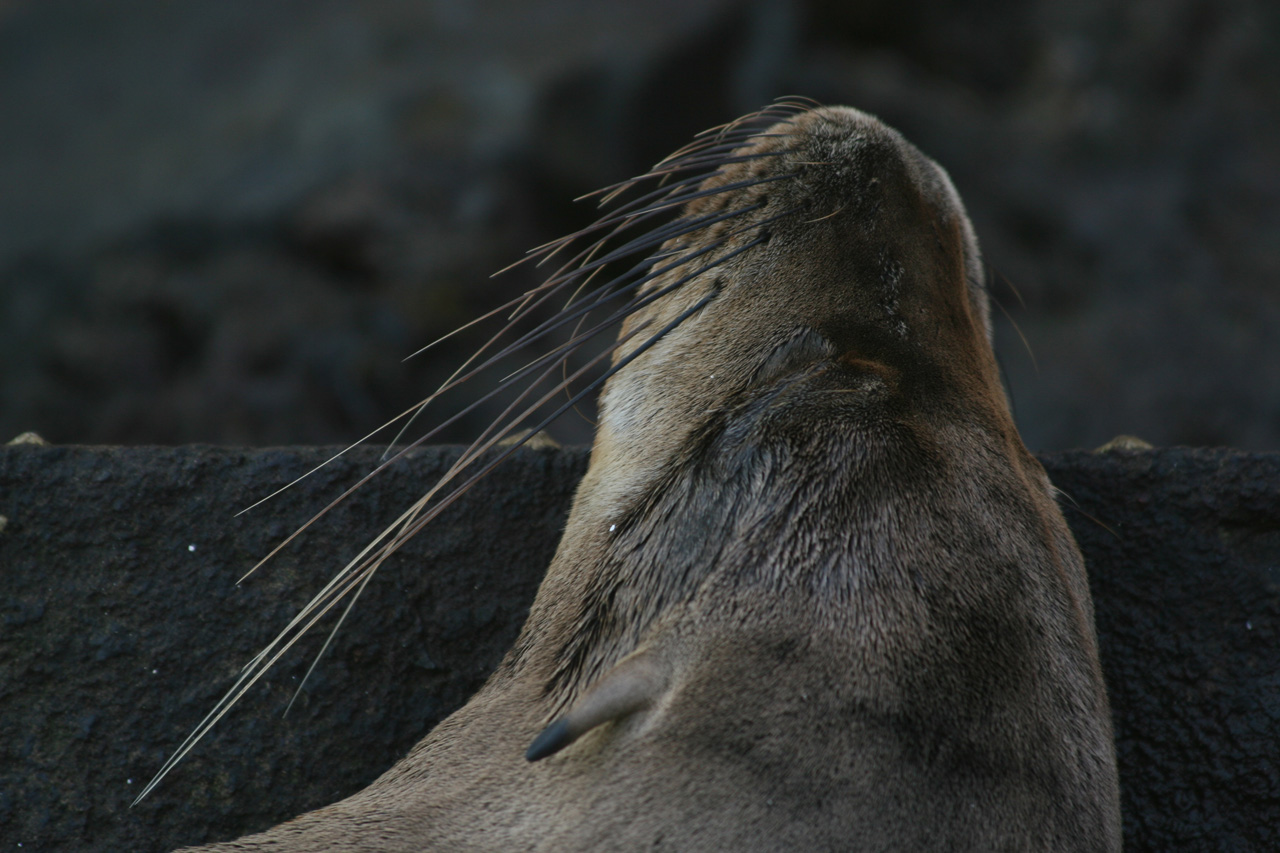
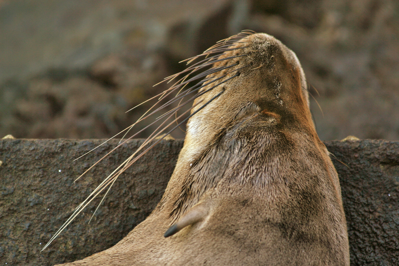
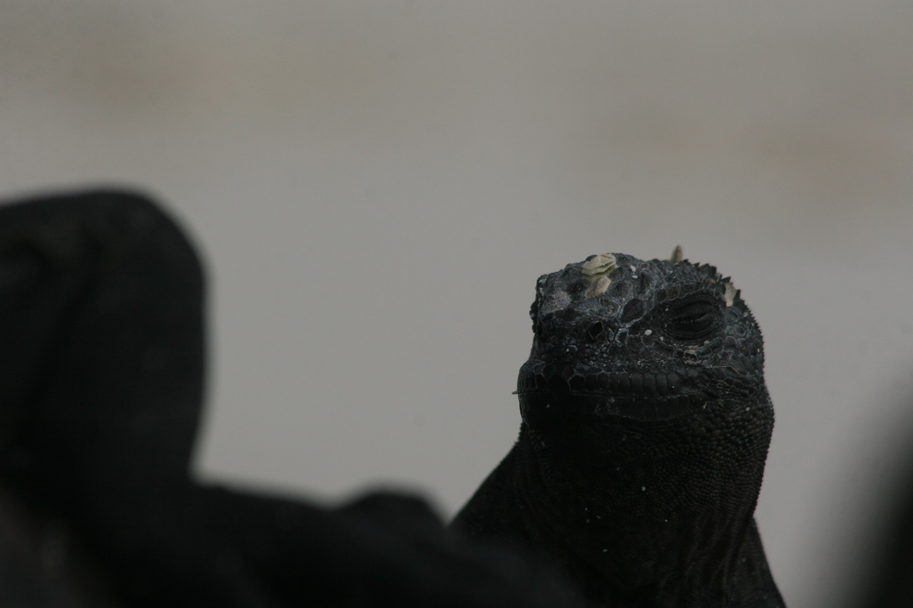
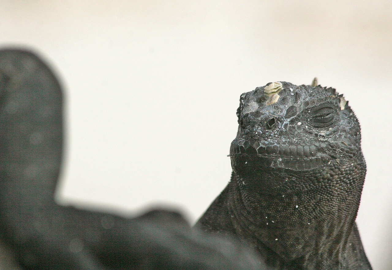
Here are two examples of what a difference the above steps can make:
==============================================
FAQ
How to correct a photo? Firstly, ask yourself what matters in the photo and what doesn't. What sort of effect do you want? Then see what could be improved and go through the sequence:
1) Improve the composition eg cut out the distracting bits.
2) Resize for screen display and email (but not if you want to print it).
3) Correct any colour cast (if present).
4) Adjust brightness. This is usually best done by lightening the shadows and darkening the highlights separately (unless the subject is evenly lit).
5) Adjust contrast (but be very careful with this).
6) Sharpen (this is almost always worth doing).
7) Diminish noise, if needed.
8) Save it as a new file name.
9) Compare with the original by flicking between them in full screen mode. This step is very important. If you are not entirely happy with the results then undo some of the changes or start again.
Note that all of these steps are optional. If the photo looks just right as it comes from the camera then no changes may be needed. Be aware that every modification you make to the original photo degrades it in an objective sense, ie removes some information. So it is best to err on the side of caution. Initially, you may find you are adding a lot of contrast or sharpness to make your photos look dramatic, but after some hours of looking carefully at your photos you will probably notice the loss of dynamic range and the sharpening artefacts these actions entail.
How much sharpening? There is no set answer. Perhaps the best idea is to sharpen until it is overdone ie you see halos, too much speckling, too hard-edged, or a rough texture (grainy). Pay particular attention to diagonal lines, outlines and horizons to check whether they are jagged or over-emphasized. Look closely at the finest details - is there too much contrast here? Does the flower look like it has been cut out with scissors? If so, use Fade or Undo. Also, it depends on the subject. Flowers seem to come out well with fairly strong sharpening, people do not. Lawns and stone buildings do not look right if sharpened very much. Blurry shots require radical measures, though of course, sharpening can never restore missing detail. All it does is increase the contrast at colour boundaries.
When are the colour balance and lightness correct? When the image looks OK to your eyes as you view the screen (assuming your monitor is set to appropriate contrast and brightness for the lighting conditions). As with sharpening, the rule I use is to correct the visible colour cast (eg too much red) in steps until it is over-corrected then undo or fade the last correction.
How to avoid the “boiling frog” effect? If you gradually slide a Photoshop control you may, by degrees, habituate yourself to an effect that is too strong. There are two ways around this problem. Firstly, apply the effect then toggle cntl-z to see whether the overall effect is too weak or too strong. In a similar vein, you can apply a “binary chop” as follows. Say you want to increase the contrast. Try adding a heap of it eg 40, which will be far too extreme. Undo that and then try 20. If that is still too strong then try 10, and so on. Fade and Undo are the two best bits of Photoshop and I use them constantly. Another solution is to save your two different versions and come back to see which is better tomorrow.
Be careful with increasing contrast, as this tends to wash out subtle gradations of tones, especially in flower petals.
How do I tell what colour cast is present? Go to Image-> Adjustments -> Variations. This will show you the effect of making six colour changes to your image. If you look at the image that looks the worst of the six variations that should tell you which colour is too strong, so add the opposite colour. Or try all 6 versions to get some practice. It's easiest to notice the colour cast in the part of a white object that is in shadow - it should be neutral grey, ie the RGB values should be equal. Another way to notice what colour cast is present is to flip between the colour and greyscale versions of the image, or to invert the colours. If the greyscale version looks like it has a colour cast then you have been staring at the screen too long! Think of it as re-calibration.
Be aware that a photo may have multiple colour casts, eg fixing a blue shadow may make something else look too red. Thus a correction may improve parts of the image but degrade other parts. This happens often. The solution is to select the part of the image that the correction will benefit and apply it only to that. Often the selection does not have to be exact. For example, the horizon or some other contour may acquire a white border after sharpening. To avoid this select the contour, invert the selection and then sharpen. Remember that what matters most is to make the main subject look good - don't worry about a bit of a colour cast in an unimportant area. Another good option is to compromise by doing half the correction, so that no part of the image looks obviously wrong.
Final checks? Always compare the final corrected version with the original by flicking between them in full screen mode - it may well be worse! You may find you have lost the profile of a mountain peak or the clouds due to too much brightness, or that you have step-wise gone too far in enhancing the original. Check the entire image for colour fringes, unnatural sky, green spots, blue shadows, white speckles, jagged diagonal lines or whatever. Also, the charm of the original image may rely on under-exposure (say), and correcting this may make the photo bland. Some photos should have soft focus whereas in others you may just want a silhouette. Sometimes you have to compromise eg make the subject look good at the expense of the background.
Basically you can have one of two goals: esthetics or authenticity, ie to make the photo look good or to make it as accurate as possible to the original scene. These two goals are not usually in conflict but occasionally they will be, in which case you need to make an executive decision. Correcting a photo involves being sensitive to its nature, eg does the image call for strong or weak contrast, should it be hard-edged or soft-focused, evenly lit or not. Another problem is that it is hard to know what to do with photos taken under unusual lighting conditions (eg at sunset or indoors) - is it better to make them look 'normal' or to allow the colour cast that the unusual lighting imposes?
Ideally, every photo should be treated afresh ie one should not just apply a standard routine of steps. There is as much room for creativity in the postprocessing as in the picture taking. Occasionally, the whole charm of an image may be due to an accidental technical flaw. On the other hand, quite often a really bad photograph can be transformed into something rather good, or at least acceptable. However, if the original is good it may need no correction or just a touch of sharpening.
PS
Lexicon
Foreground
& background colours - "Photoshop uses the foreground colour to paint,
fill, and stroke selections and the background colour to make gradient fills
and fill in the erased areas of an image. The foreground and background colours
are also used by some special effects filters."
"A
slice is a rectangular area of an image that you can use to create links,
rollovers, and animations in the resulting Web page."
A
stroke is a coloured border.
Swatch
= square window showing colour etc
PS
for fun (warning: this can eat up your spare time)
1) Try the filters. I recommend Sketch -> Chrome. Then fade it to about 80% and increase saturation to say 70% to get the colours back and then increase contrast. Optionally, try overlaying the original image by putting it down over the chromed version and adjusting the Layers -> Style -> Blending options to say 50%. Then flatten the image.
1a)
Even better, try Sketch -> Chrome. Then fade and select some of the modes
other than Normal. I recommend Color Burn, Overlay, Difference and Subtract.
This retains colour without actually fading.
2)
Stylize -> Find Edges, which you may want to apply once or twice or fade.
Good for a blast, especially on city-scapes and people, is Stylize ->
Glowing edges.
3)
Filter -> Liquify is good fun to play with, especially contrasty shots and
night scenes.
4)
Filter -> Artistic -> Water Colour will give an oil-paint sort of effect.
Try fading it.
5)
If you like colour, lots of it, try Adjustments -> Hue/Saturation and slide
the saturation to the right. Fasten your seatbelt.
6)
To radically alter colours use Adjustments -> Hue/Saturation and slide the
hue pointer.
7)
To radically alter colours use cntl-m, click on the middle eye dropper and then
click at various points of the image. The colours will shift to the opposite of
the colour where you click.
8)
Another way to get novel colours is to use match colour (see instructions
above) to get colours from one image into another. Some surprising results.
9)
Fun distortions are Filters -> Distort then Glass, Ocean Ripple or Spherize.
10)
Use Adjustments -> Invert to get a negative image. If you just want colours
reversed then use Adjustments -> Hue/Saturation and slide the hue pointer to
extreme right. If you want to reverse dark/light but with colours unchanged
then Invert and use the hue slider. Of course you can do any intermediate
setting as well.
11)
Use layers to mix different versions of the same image to achieve the blend
that you want.
12)
Use Stylize -> Find Edges, raise contrast and desaturate, then copy the
original and merge at about 65% of the original predominating and finally raise
the contrast and saturation of the merged image. This results in a painterly
image.
13)
Hit control-M to get Curves then raise the curve at the 1/4 point and lower it at the 3/4 point, or vice versa.
This causes some surprisingly colourful effects.
14) Try Image->Adjustments->Posterize, setting number of levels to a small value.
15) To remove all greys from a BW image, do cntrl-m and click on the left dropper. Then click on a light grey in the image.
16) Try Image->Adjustments->HDR Toning and experiment with the various settings.
My
Shortcuts
NB
It is wise to save your shortcuts in case of a re-install. To do so, click on
the name of the actions to save in the Actions window, click on the right arrow
symbol and choose Save.
F2 to resize a horizontal photo
Shift-F2 to darken blown-out highlights (Adjustments -> Replace Color, click on result square and set colour # (below 'B') to ffffff, set fuzziness to 200, lightness to -10.)
Control-F2 reverse colours
F3 to increase contrast using Kelby's 3-point method Curves
Shift-F3 to remove blue cast
F4
to sharpen strongly - check for colour changes. This is sharpen method 3 shown
above. Can fade this one.
F5
to reduce horizontal size to 240
F6
to do standard sharpen ie unsharp mask (45, 1, 4)
Shift-F6 to do smart sharpen (see under sharpening)
F7 to rotate a vertical shot, scale it down
F8
to sharpen people (150, 1, 10)
F9
to sharpen (130, 0.3, 0)
F10
to increase local contrast ie unsharp mask (20, 50, 0)
F11
to enlarge by 10%.
F12
to enlarge to 70 x 52 cm, ie 2 hits of sharpen (45, 1, 4), 300 dpi no resample,
4% larger resample, 13 hits of F11 (then save it as a tif file)