A Dress That Divided the Internet
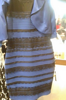
The photo above is of a dress made by Roman Originals. It is famous for dividing people in terms of colour perception, causing an internet sensation in 2015. People's different perceptions of the colours in the dress show that we do not all see the same colours.
I see the colours in the dress as blue and brown. It seems that 70% of people see white and gold. Responses from my friends: white and gold (three people), white and brown (2 people), white and mustard yellow, white and bronze, pearl white and gold, gold and silver or soft grey, grey and brown, silvery blue and goldish, blue and dark green, blue and olive green, lilac and silver, blue and black, honey brown and silver blue. That is quite a spectrum!
I know that my partner and I perceive the colour blue differently and it is common for people to disagree whether a particular colour is more green or more blue. However, the photo in question causes radically different perceptions. How can one mistake brown for gold or blue for white?
So what colour is it really?
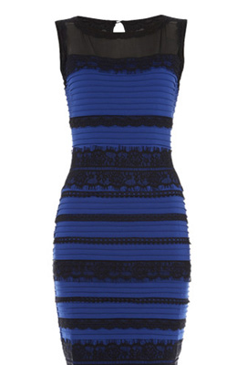
There is no correct answer as such. The actual dress is blue and black. However, it is clear that this photo does not reproduce the colours correctly. According to Photoshop, the lowest part of the dress in the photo has colours red 122, green 137 and blue 180. Subtracting grey from this we get 15 green and 52 blue, meaning blue with some green in it. The stripe above is RGB 89, 77, 63, which is hard to interpret, but essentially desaturated and reddish. A complicating factor is that the colours you see on your screen are probably not the same as on mine. This depends on the monitor, as well as on the program you are using, in particular, whether it is colour-managed or not.
Another possible complication is linguistic. Some people will call a violet flower blue or purple, instead of violet. To me, gold means bright yellow with a metallic sheen, but some people who say the dress has gold stripes may be seeing yellow, beige or pale brown.
Scientists have studied people's perception of this particular photo and written scholarly papers. There is some disagreement. However, the prevailing view is that people see different colours because of how our brains adjust the colours we see depending on the light that is illuminating the subject. To see this, put an orange, lemon and apple inside a green cloth bag and then put your head in too. Even though the illumination is now by green light, the fruit still looks much the same colour as in daylight. This is because our brains compensate for the illumination.
Perhaps one should ask two questions of this photo: 1) What colours do you see in the dress? and 2) What do you think are the colours of the actual dress? I at first said it was black and blue because it looked like the murky brown was a poor rendition of black, which turned out to be the case.
I found this article by Pascal Wallisch enlightening: Why people saw the dress differently. The text below is my paraphrase of key parts of the article:
People’s perceived colour is informed by their perception of lighting. The image of the dress, taken on a cell phone, contained a lot of uncertainty in terms of lighting conditions. Was it taken inside or outside? This matters because it implies artificial or natural light. Was the dress illuminated from the front or the back? This matters because if it was back-lit, it would be in shadow, otherwise not. Research showed that if you assumed the dress was in shadow, you were much more likely to see it as white and gold. Why? Because shadows over-represent blue light. Mentally subtracting short-wavelength light (bluish) from an image will make it look yellowish. Natural light has a similar effect—people who thought it was illuminated by natural light were also more likely to see it as white and gold. Why? Because the sky is blue, so daylight also over-represents blue, compared with artificial light.
The more someone self-identified as an early riser, the more likely they were to see the dress image as white and gold. Moreover, night owls, who spend hours in artificial light, were more likely to assume that the lighting was artificial, not natural. So they saw brown and blue.
It occurred to me that professional photographers, who are used to taking lighting into account, would see the colours correctly. I emailed the author of the above paper and he confirmed my conjecture.
Here is another article on the subject in wikipedia.
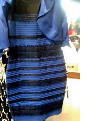
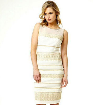
The real dress correctly photographed
Some people see these colours
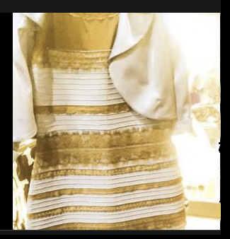
The original photo colour-corrected
Real white and gold dress
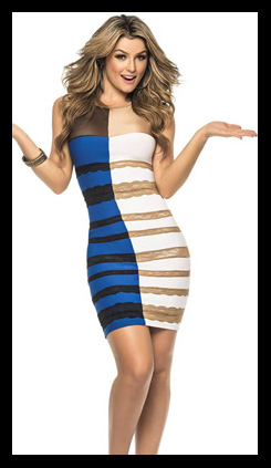
Just for fun, an each way bet
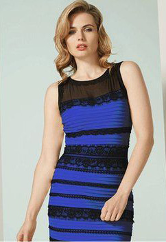
The real thing with a real model